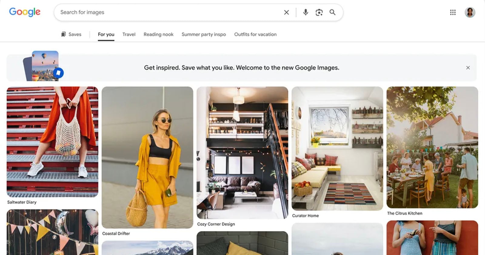
For a quarter of a century, Google Images has been the quiet workhorse of visual discovery, a blank white page with a search bar, waiting for you to tell it what you want. That stark minimalism is finally giving way to something more curated. As the platform approaches its 25th birthday, it is evolving into a Pinterest-style grid of lifestyle, fashion, home decor, and travel photos, surfaced before you even type a query. This is not a small cosmetic tweak. It is a fundamental shift in philosophy: from a tool that answers questions to a space that suggests moods. And for anyone who lives at the intersection of aesthetics and intention, it raises a fascinating question, do we want our search engines to have taste?
The timing feels deliberate. We are watching a broader cultural recalibration around how we consume and share images. Just as Leica Elevates iPhone Photography with Curated LUX Ecosystem & McCurry Filter, we see a premium brand betting that photographers want fewer, better options rather than infinite, chaotic ones. Google's move toward a "For you" tab mirrors that same impulse: replace the blank slate with an edited feed. But where Leica offers a tightly controlled ecosystem of hardware and filters, Google is opening the floodgates of algorithmic curation. The difference is subtle but critical. One is an artist's palette; the other is a mood board assembled by a machine that has watched you scroll.
This is where our honest take lands: the new Google Images is aspirational in concept but demands a careful hand in execution. A blank screen is honest, it admits ignorance. A populated grid pretends to know you. For the creative professionals and health-conscious enthusiasts who form our core audience, that distinction matters. When you are searching for a specific yoga pose or a rare vintage silhouette, a feed of "lifestyle inspiration" can feel like noise. Yet when you are in the exploratory phase, building a vision board for a shoot or a wardrobe refresh, a curated starting point is exactly what you need. The success of this redesign hinges on whether Google can read the room: knowing when to show you a grid of travel scenes and when to step back and let you search.
There is a parallel here with how we think about personal space and social performance. Recently, A Moment to Savor: Hotel Prioritizes Experience Over Social Media captured the tension between documenting a moment and living it. Google Images now faces a similar tension: does a feed of beautiful photos inspire you to create, or does it encourage passive consumption? The answer likely depends on how you arrive. If you come with curiosity, the new layout could be a gateway to discovery. If you come with a specific need, the clutter may frustrate. The takeaway we would share with a reader is this: treat the new Google Images as a starting point, not a destination. Let it spark ideas, but never let its algorithm decide what you are looking for. The most powerful search is still the one you type yourself.