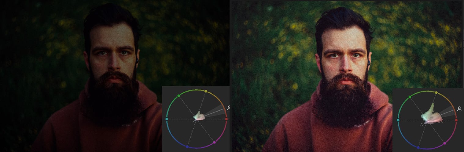
There is something quietly revolutionary about a tool that does not add a new effect but instead reveals what has always been there. Adobe's vectorscope, now native to Lightroom, is exactly that kind of addition, and it may be the most consequential color tool to arrive in the editing suite in years. We have long believed that great editing is less about applying a look and more about seeing clearly, and this tool finally hands photographers a precise, visual map of their color decisions. It transforms guesswork into informed choice.
For anyone who has ever struggled to balance skin tones, chase a color cast, or simply wondered whether their shadows are truly neutral, the vectorscope offers an answer that is both immediate and elegant. It displays color information as a two-dimensional graph, showing exactly where hues fall and how saturated they are, without the abstraction of histograms or the clutter of numerical readouts. This is not a gimmick for the obsessive; it is a practical compass for the working photographer who wants their reds to sing without bleeding into oranges. The fact that Adobe has listened to the community, bringing this feature from Camera Raw into Lightroom proper, signals a deeper respect for the craft of color grading. It reminds us of other recent moments where technical precision met artistic intention, like Gabriel Moses Honored as Trailblazer at The Fashion Awards 2026, where a photographer's command of color and composition earned him recognition far beyond the fashion pages. Both stories share a core truth: mastery of the medium begins with understanding its tools.
What makes this update genuinely useful is how it changes the editing conversation. Instead of asking "does this look right?" you can now ask "is that vector pointing where I want it to?" The vectorscope does not care about trends or presets; it shows you the raw data of your image's color relationships. For the portrait photographer, it becomes an instant check against unnatural skin tones. For the landscape shooter, it clarifies whether that golden hour glow is shifting into green. There is a parallel here to the observational patience seen in Three years of British dog shows captured in playful, candid frames, the best work emerges when you learn to see what is actually in front of you, not what you expect to find. The vectorscope does exactly that for color.
The practical takeaway is direct: open Lightroom, find the vectorscope in the color grading panel, and spend ten minutes watching how your edits move the dots. You will likely discover that your blacks are cooler than you thought, or that a favorite preset pushes highlights into magenta. That awareness is the point. Adobe has given photographers a mirror for their color decisions, and the only wrong move is to ignore it. Watch how your vectors shift when you adjust temperature, tint, or individual hue sliders, and you will develop an intuition that no preset can replace. The vectorscope is not a filter. It is a fluency.