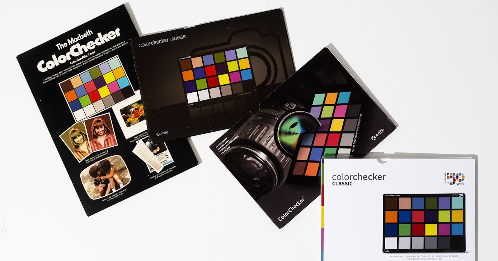
Fifty years is a long time for any tool to remain essential, let alone one as deceptively simple as a card of 24 colored squares. The Calibrite ColorChecker has quietly shaped how the world sees photography, from the family snapshots we treasure in private to the billboards and museum walls that define public memory. It is easy to overlook the mundane object that makes such imagery possible, but its longevity is not an accident. This is the kind of quiet, consistent excellence that deserves a moment of recognition, not for its complexity, but for its refusal to be anything less than reliable. In a world of fleeting trends, there is something deeply grounding about a device that has done one thing beautifully for half a century.
For our readers, the ColorChecker is more than a technical accessory; it is a quiet collaborator in the pursuit of authenticity. We often talk about the artistry of capturing a moment, but the truth is that memory is fragile, and color is the first thing to drift. This little card anchors our work in reality, giving us the confidence that the sunset we saw is the sunset we deliver. It is the difference between a photograph that feels like a place and one that merely looks like a postcard. As we celebrate this milestone, we are also celebrating the discipline of seeing accurately, a value that resonates across every creative discipline we cover. For a deeper dive into how artists push visual boundaries, our piece on Capturing Cosmic Beauty: An Astrophotography Journey with Nikon offers a parallel quest for precision in an unpredictable environment.
The beauty of the ColorChecker is that it asks nothing of us but consistency. It does not chase the latest filter or the most dramatic preset; it simply offers a baseline of truth. In an era where we are surrounded by the pressure to be extraordinary, there is a quiet rebellion in embracing a tool that is purely functional. But that functionality is the foundation upon which our most expressive work is built. Think of it as the tuning note before a symphony; without it, the orchestra of our creativity would be lost in a cacophony of subjective interpretation. It is why we find ourselves drawn to stories like the Experience Photography's Artistry: The 5 Boro Foto Fest Returns, where the celebration of the craft reminds us that the rules of light and color are not constraints but the very vocabulary of our visual language.
What would we tell a reader who asks if the ColorChecker is still relevant in an age of AI and computational photography? We would say that technology can manipulate pixels, but it cannot replicate intentionality. The card is a promise you make to yourself, a commitment to getting it right in the moment rather than fixing it later. It is not about being rigid; it is about being present. As we look to the future, we are curious to see how this legacy will evolve, especially as new tools like Elevate Your Vision: PolarPro’s Radial Filters Reimagine In-Camera Color challenge us to think differently about capturing a look directly. The question is not whether the ColorChecker will become obsolete, but whether we will continue to value the foundation it represents. For now, we raise a toast to the humble card that has given us half a century of color perfection, and we wonder what the next generation of photographers will do with such a simple, steadfast head start.